The Johnnie Walker House Combines Recycled Materials With Refined Shanghai Style to create a modern green design. In a joint effort with Singapore based agency Asylum, Agency Love developed the interiors out of a variety of materials and resources used in the whiskey making-process. The idea of developing an ‘Embassy for Whiskey’ and designing an experience more than the space played a major part in the design process and outcome. It was important to capture, grow, and nurture the whiskey culture within Shanghai’s elite.
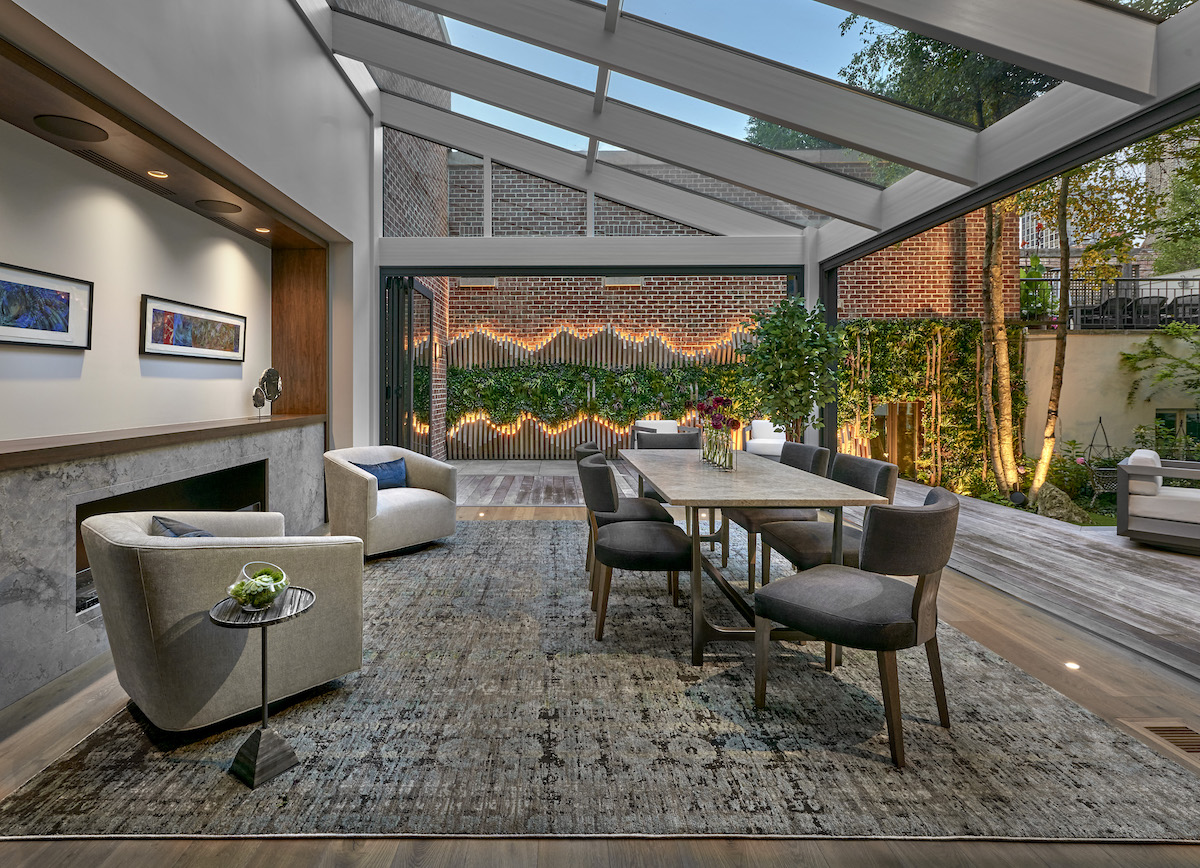
The Johnnie Walker experience is embedded in every detail of its interiors. From the undulating glass ceiling to the oak flooring and the classic fabrics and furniture to the natural elements walls, the integrative decoration mirrors the experience of discovering the organic aspects of the brand. An invitation is needed to access the exclusive House, but once you are inside, you can make sure the whole whiskey brand’s experience will be fulfilled.
One of the interior walls is organic, very textured, and made entirely from Johnnie Walker’s barley grains. Another wall is made from the brand’s classic typographic characters, carved on oak wood. There is also a copper wall that features a fantastic engraved illustration.
Recycled etched glass bottles create delicate hanging luminaries that reflect the liquor’s spirit brilliantly. Even the restrooms have the whiskey’s caramel shade and are outfitted with an antique basin and a relaxing Chinese peaks painting.
Within one of the rooms, a standing lamp decorated with Chinese cartoons clashes with dark brown Victorian inspired wallpaper. In another room, marvelous oak flooring creates a platform for tasting and chatting on the interactive blending table.
Diageo, the global alcoholic beverages company commissioned Chris Martin a limited edition of a whiskey bottle. Martin, a toy agency’s designer, came up with a new model that replaces glass for Chinese porcelain featuring ultramarine blue Ming Dynasty’s motives on the 1,000 bottles being produced. But the thing that ties everything together is the poetic new packaging design named ‘The 1910 Edition.’ It shows a celebration of an epic journey from Scotland to China over a hundreds years ago.
Source: Inhabitat
Like Haute Living Asia? Join our Facebook page or follow us on Twitter @HauteLivingMag. Want Haute Living Asia deliver to your inbox once a week? Sign up for our newsletter.


