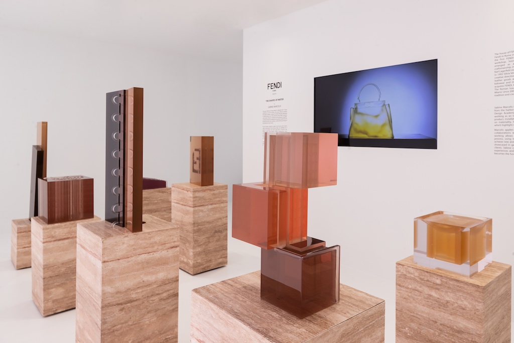
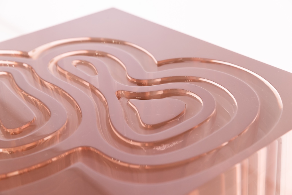
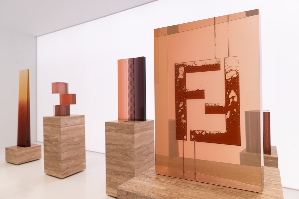
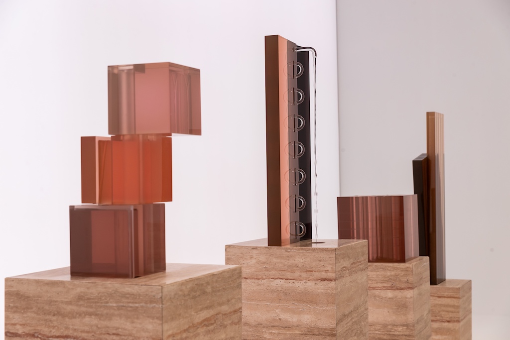
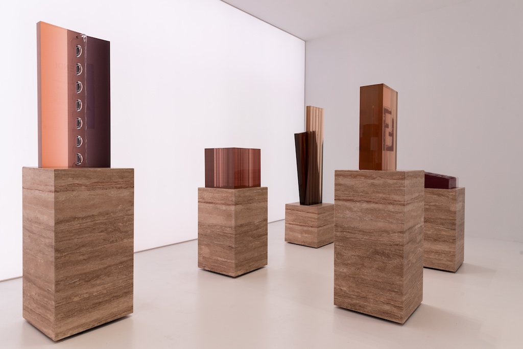
For FENDI and Design Miami/‘s 10-year anniversary, the Maison presented a gorgeous installation called “The Shapes of Water,” designed by Sabine Marcelis. Paying homage to one of FENDI’s most cherished and respected elements—water—Marcelis used water in all of her 10 sculptures, each drawing inspiration from a different FENDI symbol, including the recognizable FF logo, the brand’s headquarters, and even its quintessential Peekaboo bag, also celebrating its 10th anniversary. The Dutch designer uses cast resin and a warm color palette to mirror the Roman skies. I had the pleasure of meeting and speaking with Marcelis, as she showcased her gorgeous installation at the FENDI booth at this year’s Design Miami/.
Walk me through each of the pieces and explain your thought process behind the installation as a whole.
FENDI approached me to do the installation this year and looking at all the past years, I had first thought that I wasn’t too keen on doing furniture and I always try to do something more different and unexpected. So when I went to the headquarters and toured the ateliers and really got to dive into the history of the brand, this theme of water kept popping up. I was trying to find something unique that would serve as a starting point for the project. Then the first ever fashion movie made was made by FENDI in the ’70s and it’s called L’Histoire D’Eau and it’s about water with the FENDI Fountains Foundation, so I thought it’d be amazing to work with water as a material. So I pitched it to them thinking they’d never go for it but they were really excited and open to it, which was super nice. Then together with the FENDI team and Silvia, we sort of started thinking about how to link it to the brand, even more, so we identified 10 icons. So we have the logo, which is interpreted twice, the Peekaboo bag, obviously because it’s the 10-year anniversary, and then the “Tegole”…..Also, the brand is so linked to Rome, where they have amazing sunsets. That’s actually why I placed that piece there so you can really see the headquarters as a building with the sky behind it.
What does it mean for you, as a young artist, to partner with such an iconic brand on this project, seeing as how it is also its 10-year anniversary with Design Miami/?
It’s a total honor, of course. I think the great thing about it is that for me, it allows me an opportunity to do something that for one, I never would’ve done out of my own free initiative because it’s so linked to the brand. I used to think that if you were working for a brand it’d be a compromise from your own ideas. but in a project like this, it’s a sum of all parts, which just adds to the project. It’s not a compromise, it’s like two worlds coming together to create something new. For me, it was a really super opportunity to try something that I would otherwise not be able to just do on my own.
How, if at all, has social media impacted your art world? Was that part of your thought process at all in your creations?
I realize that Instagram has been quite an important part of why I am able to do what I do. It’s easy now for people to find me if they see me on Instagram. So now there’s a quicker link between the client and the artist than there was before. But I find it problematic that there are museums that are actually made to be “Instagrammable.” For me, it was about creating a space to have an experience and light is extremely important to experience these objects. The reason we put these light boxes in the background is because it’s how we did the photo shoot and that’s how each came to its best abilities. For me it’s purely to present the world in the most optimal, physical way. What I always try to create is for someone to come and look a little bit longer, to take their time and look around each. They’re designed in a three-dimensional way because they look a bit different from each angle.
What about the music? Can you tell me about it?
I worked with one of my good friends, a photographer, Carl Kleiner. We set up all the fountains in my house and for a week he stayed on my couch and we did the photo shoot and the film all within that week. He created the music with it as well, always knowing it was going to be presented here as part of the whole experience. It’s got a bit of a water-dripping effect but it doesn’t compete with the sound of the actual water from each fountain, it’s more of a calming experience.
Why is cast resin your material of choice?
It’s a material i’ve been working with for quite a long time. The beauty of working with one material for a long time is that in every project you can challenge yourself and the material a bit more. Every project is a new opportunity to go a step further. For me, my fascination with this material from the beginning is that you can so readily play with the interaction of light. You can completely manipulate it to have so many different characteristics. Now it has all these reflective qualities because it’s super polished. And another material I work a lot with is glass, which has a lot of the same qualities. You can really play with it and layer it. And it’s also the perfect material to make these complicated shapes.
Where did you draw inspiration from for this particular project?
The idea of using the FENDI icons was the initial thought and then understanding the engineering of how everything works, the objects kind of shaped themselves. I like to work very freely and let the restrictions of an object shape it itself. I also looked at a lot of sculptural works but also machinery, marine objects…a lot of random satellites of inspiration that came together to shape them.
What do you hope that visitors who come to see the exhibit take away from it?
I think it’s just to appreciate subtle moments of beauty, which is also why I thought it was very important to do the video. If you are not here physically, at least online or even now, if you’re not looking at the “right” things, you might actually miss these nice little moments happening. This fair is very busy and very big. I think it’s nice to slow down and zoom in a bit on some subtleties like this as well.
What is your favorite piece here and why?
My opinion is completely biased because my favorite piece is the one that was most difficult! It’s the one with the three boxes stacked on top of each other with the water doing a 270-degree turn. It was very difficult to put together and get it to work properly so it’s like the piece that I respect the most. I’m really happy with it. It’s also the piece that I imagine can be scaled up. I would love to create that as a big public installation with a big water feature.
How did you decide to incorporate the water into each piece?
I think it was more a matter of what different effects can be created with water. So it can be disrupted by a pattern or bubbles can go through it. Some of them were very easy. Like “Selleria,” I thought to use water for the stitching. And the “Roman Sunset” is a large piece, so we can make the waterfall down the front. And of course, just trying different things. So for instance, the bubbles in one piece are much bigger than another. It’s because they have a lot more space to be bigger and faster and with the other, you can see the side is only a few millimeters thick. So when the air gets pushed through, the bubbles get squished flat.
What can we expect from you moving forward, both individually and with FENDI?
I know that we’ll be traveling to Hong Kong for the Art Basel there, which is super nice. For me, my aim is always that with every project is a new challenge, a new scale. I hope this will evolve into bigger fountains. And aside from this project, I’m doing a lot more architecturally-scaled things now, which is a different challenge with different things to take into consideration. And for the Salone [del Mobile] in Milan in April it’ll be two big installations as well. I am just upscaling a bit but still more focused on temporary special installations.
All images courtesy of FENDI.


