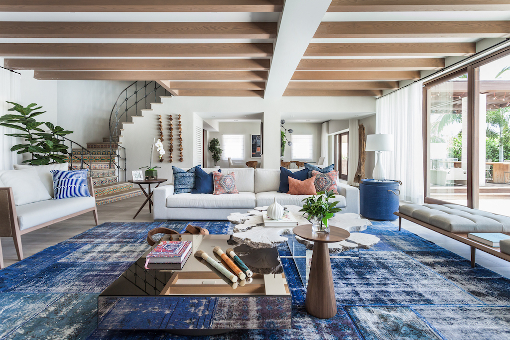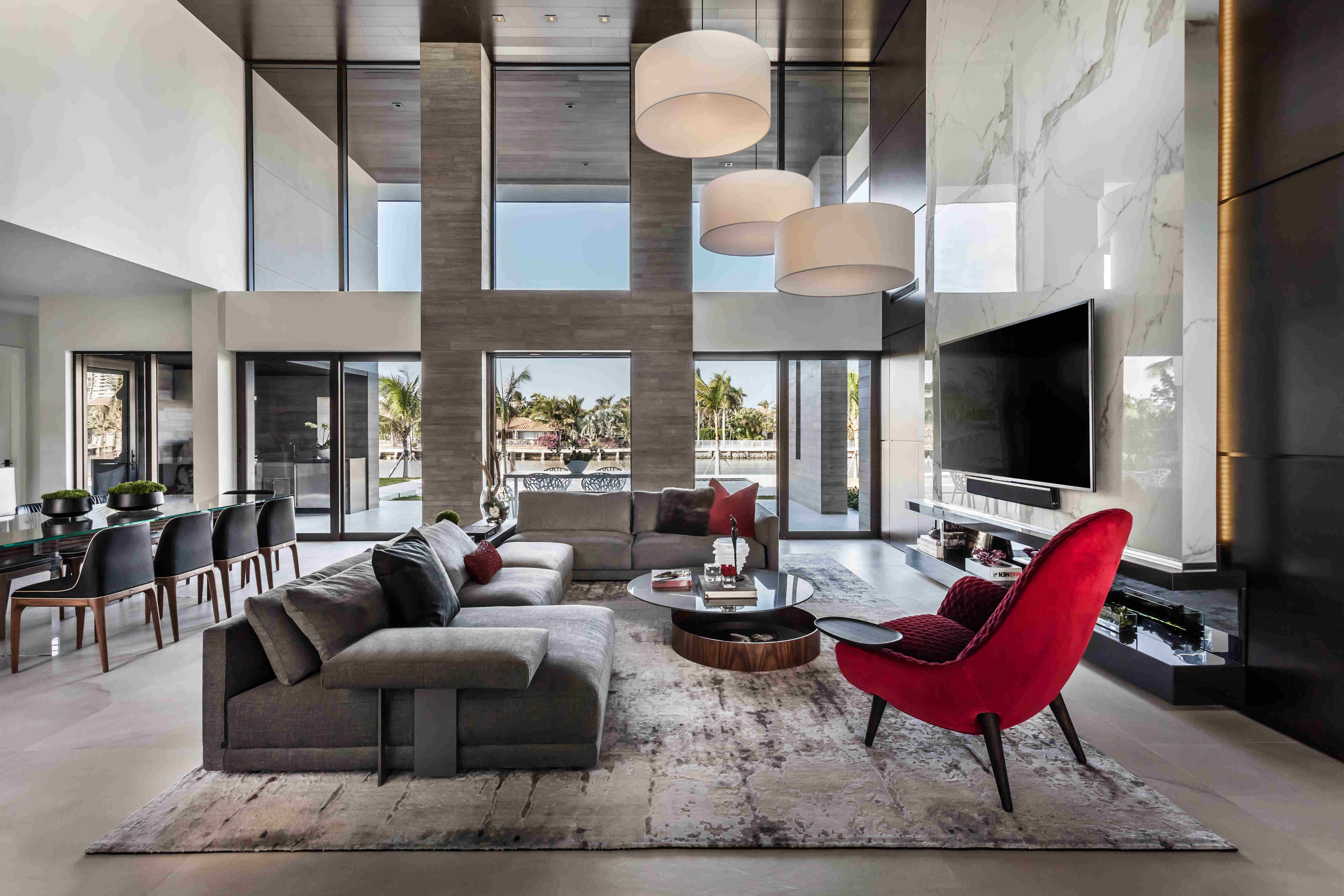
This complete structural makeover of a two-story 1978 penthouse sought to integrate the kitchen and social area, creating an open layout allowing houseguests to interact more fluidly, while taking advantage of the natural light afforded by a reconfigured, double-height view of Miami’s Biscayne Bay. Materials were chosen to lend richness and texture to the space, defining proportions and ratios, with an emphasis on clean, compelling lines to complement the clients’ entertaining objectives while embodying a warmer, “Modern Eclectic Contemporary” feel. Custom furniture including a sleek, youthful bar and seating as well as oversized artwork emphasize proportion in the two-story space while maximizing the space’s relationship to the double-height view. The design aimed to toy with depth and drama, employing a custom geometric chandelier, streamlined furniture, and glimpses of color to create a welcoming, interesting, and eye-catching space.

Design Statement:
The owners bought this two-story 1980s penthouse to live out their golden years and entertain their large family. In the original structure, the kitchen and social area were separated; one design objective was to integrate these spaces, creating an open layout that allows houseguests to interact more fluidly, while taking advantage of a reconfigured, double-height view of Biscayne Bay.
Materials were chosen to lend richness and texture to the space, defining proportions and ratios, with an emphasis on clean, compelling lines to embody a “Modern Eclectic Contemporary” feel. Oversized artwork; furniture from Patricia Urquiola, Poltrona Frau, Luminaire, and Jaider Almeida; a custom-designed Ornare kitchen; rugs from the Rug Company; and a custom geometric lighting fixture in the dining area emphasize proportion in the two-story space, while maximizing the space’s relationship to the double-height view.

The original layout of the space featured a floating staircase in the middle of the foyer/living area, interrupting the flow of the living space. Ceilings were low due to an outdated AC system. We used the residual areas between bathrooms to encase the new stairway, complete with stone-integrated Ann Sacks sconces, creating a large foyer that organized the circulation on the first floor. The new foyer also serves to display part of the clients’ art collection.

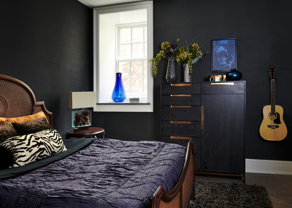
The original space on the second floor had similar problems with flow. By relocating the stair and cancelling a Den/Bedroom, we reorganized a Guest Bedroom illuminated by Axolight, created a new Laundry Room, and achieved a dramatic, open, two-story dining room. In the Master Suite, lit by Bover, we opened the space and completely rearranged a labyrinthine Master Bath and Closet to obtain a simple, linear layout that provides a flexible design solution, seamlessly integrating the Ornare custom-designed closet to the rest of the space. Now the owners can wake up and take a bath enjoying a dramatic bayside view.


Photos courtesy of Kris Tamburello


